
…and how to keep people safe at side-roads
In the UK there are now quite a few places where people are striving to get decent infrastructure in place to support cycling.
But the rules – that we’re expected to respect – aren’t up to the job. I’ve described the problem like this; We’re trying to copy Vermeer (the painter), but using only fingerpaint.
One of the situations where we’re lacking any standardised legal, effective design is where we want to keep people safe as they cycle across the end of a side-road.
I’m going to discuss this individual issue and ask what we would design if we were free to ignore the rules (but still wanted something safe and effective). What should we be demanding from an updated set of rules? I propose a new design to prompt discussion (Plenty of healthy discussion/criticism/comment is already happening in the comments at the end of this blog.)
The problem
(copying Vermeer, but using only fingerpaint)
In other countries we can see many examples of really usable, effective infrastructure – designed and adapted through decades of development and experiment. We can see that these would often work well here in the UK (and in other places too). But between us and this utopia are a set of seemingly immovable rules – rules about what you’re allowed to build here in the UK…
…and if there’s one thing that the UK doesn’t like to do it’s to change the rules around road design (and signage/marking).
So in the UK we find ourselves trying to copy refined foreign designs, but armed with unrefined tools – a bit like trying to copy a Vermeer painting armed only with fingerpaint.

Vermeer (regular readers will notice I chose a Dutch painter) is known for the delicacy of the effects he achieved – with a refined technique that meant his paintings can glow with light and shade.
Clearly we couldn’t copy his work without the tools to do so. With fingerpaint we’d just make a mess.
Shark’s teeth versus UK give-way symbols
My favourite example of a refined Dutch/Danish infrastructure tool is the ‘shark’s teeth’ markings used to indicate ‘give way’. I’m not the first to point out how good a tool these are.
This marking clearly indicates ‘give way’ – but it also indicates a direction of travel. In this case it is totally clear to road users that you can drive away from the photographer over the marking (but that coming towards the photographer is not allowed).
Shark’s teeth can be stretched along a wide line and remain clear, or can be used in a really small space, and still remain clear.

Shark’s teeth can be used to indicate a very complex set of priorities. Can you imagine clearly marking out the priorities indicated in the image below, but using standard, legally sized/placed, UK markings?
There are legal markings available – that’s not my point – the point is that they would be difficult to understand in such a complex environment, and that they would take up too much space. This environment is already very complex and intricate – and with our UK symbols I think it would become completely incomprehensible.

Here in the UK we have one standard symbol (actually legally a combined set of symbols) to indicate ‘give way’. This is really designed around marking a simple road junction (although is strictly also to be used for a few other very specific scenarios). It works well in this situation. We can see that the side road gives way to the main road. It’s just fine given this wide space and simple message.

But once you lose the space for the full thing – once you’re working in a more confined space – or once you’re trying to communicate something more difficult – it falls well short of requirements.

The Dutch symbol is used everywhere – emphasising priorities on cycle tracks, at zebra crossings, at road ends, and even to mark priority where a cycle track crosses a road, like here:

The UK symbol is really just designed to say “this is the little road – you have to wait for people on the big road.” Once we need to say something more subtle it fails miserably. Even with best intentions the result is often a real mess – really just as silly as my fingerpaint ‘Vermeer’ above.


And in case anyone is wondering – I don’t see how any of these road markings can even be legal (for a variety of reasons – the UK legislation is very restrictive and every symbol is for a very specific purpose and is to be used in no other situations).
In an attempt to keep everything standard and safe what the UK has created is so many non-standard situations, which aren’t covered by standard designs, that we have a free for all – with everyone making it up as they go along. This is the worst of both worlds. Designers are neither sticking to the law, nor creating something which is properly fit for purpose.
It’s time for change.
I’m wondering if the time is right for some changes.
The Scottish Government, in particular, has a much more positive approach to supporting walking and cycling – in comparison to the UK (Westminster) Government. And the Scotland Act 2016 recently devolved powers over traffic signs (which includes all the lines and symbols) to Scotland.
Would Scotland be willing to step ahead of the rest of the UK in this regard?
(Please note, I’m no legal expert – my understanding of the devolution of road signage powers is based on ordinary media reports, and a general familiarity with the UK signage legislation – I’d be pleased if someone could confirm my interpretation. Also any points in this article about the legality or otherwise of particular symbols are a lay-person’s understanding based only on a very general familiarity with the rules.)
A green stripe isn’t enough
With all of this in mind, what if we take one very specific problem and abandon the rules – but at the same time try to create something both safe and practical?
I was speaking to people recently about situations where it is NOT appropriate to use continuous footway to protect a cycleway across the end of a side road. What if we work on designs for crossing the end of side roads safely (on a bike)?
I’m a fan of continuous footway – and I’ve written several times to explain how this design feature should be used. But I’m a little worried that people here sometimes try to use continuous footway (and cycleway) in situations where it won’t work well. The Netherlands uses continuous footway (and cycleway) in very specific circumstances, and alternative designs elsewhere. (For lots more on this, see Design Details (1))
Here’s an animation illustrating our starting point (people on bikes sharing a wide road with fast traffic, and distracted drivers)…
We want something better than this.
In many places there have been experiments with the use of ‘light segregation’. Here’s a relatively well known example (Streetview link):
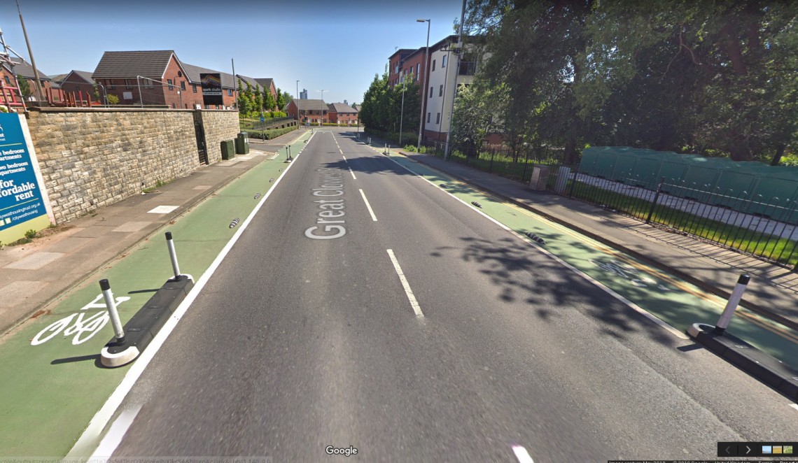
Rather than full separation from traffic, a combination of bollards and paint is used to keep people effectively separate. I’ve modified my first animation to show this kind of solution:
In this example (in the animation) I’m assuming we’re dealing with some kind of industrial side-road. I’m assuming that we’ve decided that the need to allow for longer/heavy vehicles – or limitations on budget – mean that we are definitely not going to have a continuous footway/cycleway here.
The thing is, ‘light’ segregation typically becomes ‘no’ segregation (just paint) at side roads.
I’m particularly dissatisfied with the ‘strip of green paint’ style of solution. This design worries me because I see it starting to catch on. It’s not completely without value, particularly when new and bright. But embattled designers across the land are seizing on this as the new standard… whether or not it actually works …at least it can be copied from elsewhere so it’s not our fault…
Would you allow an unaccompanied 12 year old to cycle along this road? Would you feel that they would be safe passing in front of the car? What about in rush hour with people queuing across the junction?


I simply don’t think this ‘strip of green* paint’ works (well enough) in a UK environment – it’s not distinct enough to catch the attention of people unused to looking out for people cycling. And don’t forget, we typically allow our ‘paint’ to wear away to nothing before replacing it – so even if this is a bit safer now, will it be safer in 10 years when the green has almost gone?
*(even if the paint is blue, or red – paint isn’t magic – and note I’m using ‘paint’ here as a generic term – this surface can be achieved with different materials)
And the law isn’t clear enough either. I’m certainly not going to trust that someone who kills me on this strip of green paint will be prosecuted for it.
Solutions somewhat like this might work relatively well in Copenhagen – but people driving in Copenhagen will encounter a small set of standard designs across the whole city. And of course if you look to the Netherlands – where people are the most used to looking out for bikes – designs like this are either absent are being removed for something safer.
All this got me thinking… it’s all very well to moan, but what would be better?
What solutions could we come up with in the UK for this purpose – for situations where we want people cycling to be safe, but where we don’t want to use continuous footway, or full segregation and traffic signals.
What if we were prepared to challenge the UK rules – what would we ask for? And what if we couldn’t be idealistic, but were forced to be realistic and practical? What would ‘good’ look like in these circumstances? What if we need something immediately understandable in current UK conditions?
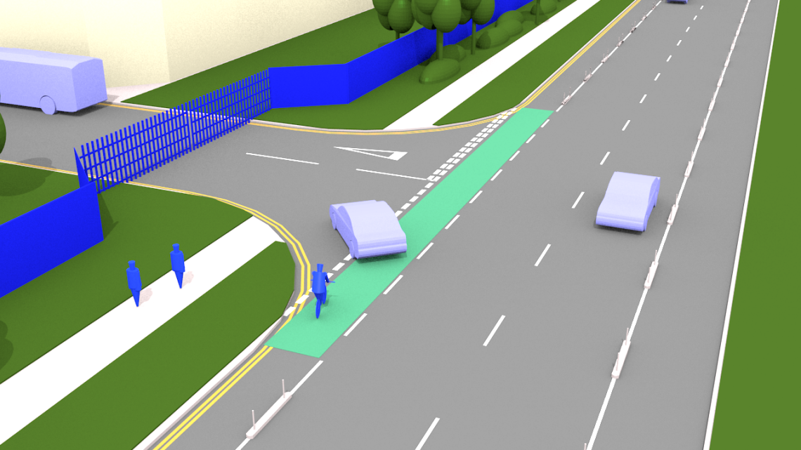
An alternative for side road crossings
Here’s one idea – one design on the basis above. I offer it to prompt debate. I’m asking for opinions and ideas, and even alternative designs. Can you do better?


Design brief
For reference here’s the design brief I mentally wrote for myself – which others might like to work within.
I want something which:
- would keep people safe when cycling across the end of a side road;
- would work where ‘light segregation’ is being used;
- is a practical and effective design in the current UK environment (which would immediately be understood by road users);
- is not a continuous footway/cycleway*;
- would offer a clear enough indication of priority that someone ignoring it would be prosecuted.
And – as noted above – the design does not need to follow current UK rules. My design would definitely not currently be legal in the UK.
*To be clear, this is not intended as a design to be put in place where continuous footway is the answer. To understand where continuous footway is definitely the right answer, even in the short term, have a look at the articles linked at at the bottom of this article.
Design summary
I decided that this design could not use Dutch shark’s teeth because in the UK triangles have appeared all over the roads – sometimes tangled up with junction markings – to indicate speed humps or other similar changes in road surface. This proliferation of triangles (with them sometimes even being used to pretend that a hump exists in the road when it doesn’t really) has devalued them as a road marking. I’d really like to see the introduction of shark’s teeth in the UK, but we have to pick our battles. Here I want to create a design which would work even without shark’s teeth.
As many will know, a new design has become legal recently in the UK – for something called a ‘parallel crossing’. This is basically a zebra crossing, but with two lines of squares (‘elephant’s footprints’) parallel to the zebra markings – indicating the route for cycling.
There is not space in this situation for a full parallel crossing – with the full set of legal markings. However in the UK the zebra stripes are very well recognised, so I’ve based my design around a modified/simplified parallel crossing.
So would this work? In comparison to the previous situations, would the person driving be more likely (or not) to notice?
Design details
If you’d like to understand my reasoning for the various features of this particular design then read on – I’ll now list/explain them. If you’re only interested in the bigger point then you might choose to skip to the conclusion…
Details – a non-flashing short ‘Belisha beacon’
In this design I’ve used unlit yellow globes on low black and white posts.

Is this a good idea? Or a silly one? Is it any sillier than the existing Belisha beacon? Belisha beacons are rarely bright enough to be seen in a modern context – yet they demand an electrical supply, and maintenance. Would this short post be simple to understand, even if the globe didn’t flash? Would it block the view of a child if the post was too short? Would it be a bit difficult to manufacture? It would be visible from all sides, but would a simple sign be better?
Details – elephant’s footprints
I’ve included the normal zebra stripes, and the increasingly standard elephant’s footprints, but also a green stripe to emphasise continuity.

Zebra crossings are well recognised and widely understood. Including the zebra stripes makes it much more likely that people driving assume they need to give way. I’ve simplified the markings here – omitting various additional symbols.
Elephant’s footprints are a standard marking in the Netherlands – immediately recognisable as indicating a place to look out for bikes. We should seize the opportunity to use them here too.
Is this simplified marking too simple? There’s a boundary line (indicating where to give way) at the back of the picture (above), but for clarity I’ve omitted the matching line at the closer side of the crossing. Does the loss of these symbols mean the design would be more or less effective?
Details – track at road level
The cycle track is at the same level as the road at all times.

Does this introduce any problems? Is this simplicity enough to offset the inconvenience caused by the wiggle the design introduces?
(My wife wants me to call this the ‘Weetman Wiggle’ in a bid for fame and glory…)
I’m working on the principle that this also makes the design cheaper. None of the original footway is (necessarily) needing to be removed – the new infrastructure is built where previously there was roadway.
Details – give-way marking
The design leaves a little space for the standard UK ‘give way’ marking – but with a shortened centreline.

Is this adequate? Or is this a mistake? Could we do without this marking completely? Could we come up with something new?
I should be clear – the deviation in the cycle track should be the minimum required to allow for the infrastructure which tightens the corner – this small space is intentionally not wide enough to allow a car to pull entirely off the main road.
Details – green (red?) stripe
I have used a green stripe.
It could be any other colour, but it would be good if the UK could make up its mind what colour should be used to indicate cycling infrastructure – I’d favour the nice Dutch brown-red colour. But that’s an argument for a different blog article (see Ranty Highwayman here).

I’ve started and ended the stripe a good distance from the junction. It needs to be visible to people (driving or cycling) well before they reach the junction. Being able to see the wiggle in the green stripe makes it clear from this angle that the path continues across the road end.
Details – side-road narrowing
For people coming from the side-road – driving towards the bigger road – I’ve added a narrowing of the road.

This is a standard Dutch treatment at a road end. Is this sufficient to highlight the crossing? Is there anything else (beyond the globe-posts) which would help?
Details – dropped kerbs
I didn’t get around to drawing dropped kerbs for pedestrians – nor tactile paving. But I’m assuming they would fit here – simply taking the footway to the road level.
I’ve intentionally not raised the road on a hump here.

Would the combination of infrastructure here cause any confusion for someone who is blind or partially sighted? There would be a full kerb edge separating the cycleway from the footway. Is this simple or does this introduce any engineering issues?
(While we’re talking about kerbs, I should be clear – safer angled kerbs should be being used in this design where the kerb edge is along the cycleway. I didn’t get around to drawing these).
Details – kerb line radius
The kerb edge I have drawn (detail in the image below) shows a tight corner. I want to slow people down, not keep them moving. There is a small (tiny) kerb line radius here.

I’ve included some substantial bollards to help emphasise the presence of this kerb/corner.
If this road is to be accessed by larger vehicles it will be necessary for these to be driven onto the ‘wrong’ side of the road – both when joining and when leaving the side road. This is an intentional feature of the design. I’m assuming a relatively low number of such vehicles. I’m assuming that the minor risks and inconveniences that this introduces are more than made up for by the improvements in safety for those cycling and on foot.
Is this reasonable?
What if the kerb was swept further in? How big a sweep – how large a radius – could be used before safety was significantly compromised?
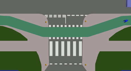
I’ll run the animation again, this time showing a design with a much more swept kerb line. But remember that in these videos the person driving only behaves in the way they do because that’s how I’ve animated it. Feel free to question this animation.
To summarise…
So to return to the main questions…
Would this design work?
Is this design better than the green stripe solution? Is it practical? Would it be relatively cheap to build? Is it close enough to UK standards so that it is easy to interpret? Do you have a better idea? What are its limitations? Where would it work well? Where would it fail?
What other re-designs should we be imagining – if we free ourselves from the rules (but not the requirement for safety)?
Which rules and conventions need to change if we’re to be able to design infrastructure to properly support cycling and walking?
Surely in the UK it is time for us to step ahead of 20th century (1960s?) infrastructure tools? If we’re to build a new 2020 infrastructure, fit for the 21st century, we need new tools. We need the law to catch up… not to become ever more professional at trying to work within it.
Addenda
An image of this junction from Twitter jumped out at me just after publishing this article (thanks bostonian_abroad / @walking_boston)

Superficially it has similarities to the design I created above. It’s interesting to ask what’s different. What’s good about it? Will it work? What’s problematic?
Compare this image to mine. Is the cycle track as obvious? Why not?

How about from the side road? What’s lost by relying only on the white paint and the hump, and by leaving everything else the same?

I’d love to hear from locals about whether it works.
The following Streetview links might also be interesting – there are some similarities in these designs (to my suggestions) but also important differences.
- Shaftmoor Lane, Birmingham (4 crossings) – thanks to Phil Jones for the heads up
- Edgbaston Road, Birmingham (just zebras)
See also…
- Design Details (1) on continuous footway
- Amsterdam vs Copenhagen (part 2) discussing junction design
- Amsterdam vs Copenhagen (part 3) some discussion of issues with UK copies
- Read everything – New here? This is a suggested reading order.
Comments…
- As I’ve said above, my intention is to prompt debate. Please use the comments below. Feel free to criticise. Or say nice things… the choice is yours. There are already useful comments and lots to be learned in what’s been contributed.
If you landed here from a Twitter link on a mobile device you may need to press ‘Leave a comment’ below to see the comments on this article or you can reload the page to see them.
Some highlights to be found in the comments below:
- meltdblog contributed an image of a location in Melbourne Australia, where a design with some similarities does not work well.
- Sam W and bohrsatom give me an opportunity to explain more about why I’ve not suggested a raised hump/table, and why I’ve argued for the crossing to be close to the road end.
- hanneke28 contributes a Dutch perspective (directly from the Netherlands) and points out some possible modifications to the design, including methods to increase the space for large vehicles (only) to corner.
- Andy R asks/advises about UK legalities, and my suggestion not to allow vehicles to pull entirely off the main carriageway.
- Catriona Swanson contributes local knowledge around the success or otherwise of the location (with the green stripe) which I used as an example of a problematic design.

There have been some similar experiments in Melbourne Australia, google street view can be a few years behind whats actually there but you can find recent images:
https://goo.gl/maps/1Z4vN77SKqN2
That should be a view of the intersection of Amess and Park Streets in Brunswick. Driver compliance with the give way signs at the shared path crossing is poorer than pedestrian crossings or traffic lights. So keeping bicycle lanes parallel to the traffic is still seen as the better option.
[Robert Weetman made a minor edit to correct the Google Link]
LikeLike
meltdblog – I’ve edited the Google link to show the junction I think you mean. Thanks, that’s a useful link.
Assuming I’ve understood what’s going on here then this is a good example of what NOT to do. It’s really quite unlike what I’ve drawn. In this image there are great wide swept corners, allowing people to keep speed. There’s a big space between the end of the road and the cycleway. The cycleway is marked on its own. The kerb edges of the road continue with no diversion (so visually the road continues in a straight line). The marking on the road, I’d guess, does not imply that the cycleway has legal priority? This is a really good example of why I wrote the blog. It’s another example (like the green stripe) of trying to solve things primarily with paint. It’s entirely predictable that it won’t work well.
LikeLike
Thanks for fixing the link.
The continuous shared path is also for bicycles, that intersection has both types of bicycle infrastructure to cater for different users. The shared path crossing is an example of all the detailing needed to shoehorn a simple continuous path priority into Australian road design standards (not far off the issues in the UK). The intended turning radiuses are very tight, but only enforced gently with the hatchings rather than kerbs.
LikeLike
Thanks for this and I think your design looks good. You say not allowing enough space for a driver to pull entirely off the main road is intentional – could you explain why? I thought this was a feature of dutch junctions and helps turn the driver more perpendicular to the cycleway they are going to cross for visibility.
Also can you say more why you would prefer not to raise the road surface at the crossing? I’d expect that a hump would be another good way to reduce vehicle speed approaching the crossing?
Lastly, as someone not trained in UK markings law, what would make your design not legal (I can see the beacons are novel, but what else)?
Thanks!
LikeLike
Hi Sam – I don’t often see this (space to pull off the road) as a specific feature of Dutch design, other than that some (many?) continuous footway/cycleway situations have plenty of space. That’s a good design – but not what we’re looking at in this situation.
You might look at this one, for example [ https://goo.gl/maps/Ek8PA5eb1nw ] and talk about having space to pull off the road – but this design is fundamentally different. This is not a turning into an ordinary side-road – this is continuous footway (as in my linked blog post). There are markings on the cycle track, but the main design feature here is a steep/sharp ramp, a solid and very straight cycle track in a solid and very well recognised colour, and this acts as an entrance gateway into local access roads only.
The example meltdblog gives in the comment prior to this one [ https://goo.gl/maps/1Z4vN77SKqN2 ] shows what you can get if the crossing is too far from the junction. It no longer feels like the cycleway is part of the road. And to do this in combination with light segregation is going to mean a huge wiggle in the cycleway. We’re looking for a design which keeps the cycleway with priority, not has it bending all over the place negotiating to make progress.
I was aiming to put the crossing very close to the road end – with a sharp corner this is a place where people are forced to drive slowly – whether entering or leaving the side road.
Really its all about prioritising the cycleway I guess.
On the ‘why is this illegal’ question – it’s important to understand how UK road marking law works (TSRGD – https://tsrgd.co.uk/pdf/tsrgd/tsrgd2016.pdf ). Basically this tells you what is allowed, and that anything else is not allowed. It’s intentionally inflexible – which isn’t necessarily a problem if it’s used as a tool to support progress rather than being seen like a holy book, handed down through the generations to be worshiped.
Ranty Highwayman has a good, full, discussion (but in human terms) of exactly what is required at a parallel crossing – here: https://therantyhighwayman.blogspot.com/2017/04/drawing-parallels.html and the relevant page of TSRGD (above) is 476.
You can see that my design is missing all sorts of features – which a parallel crossing is required to have. Most obviously/crucially I’ve omitted one of the give-way lines (1.1-3.0m from the elephant’s footprints), and the zig-zag lines at the road edge (must be 2+ marks in a line). I’m not an expert, but it’s safe to assume, if you don’t know for definite and can’t find the rule that says otherwise, that any normal feature of something like this is absolutely required. That’s the way the law works here. I suspect there’s a rule (or convention) somewhere about exactly how close a parallel crossing is allowed to be to a junction too.
LikeLiked by 1 person
Thanks for clarifying – yes I was conflating with continuous footways!
Couple of other questions please:
1. Would you consider this approach for a bidirectional cycleway?
2. Would leaving enough space to stop a car between the turning and the cycleway be any more of a consideration if you expect both roads (the straight one and the one joining the T) to be busy and queuing at peak times? I’d be concerned that a driver waiting a while to turn out of the ‘side’ road would often block the cycleway if they don’t have space to wait in for an opportunity to turn out?
Waiting to turn out from way back behind the ped and cycleway crossings may be following the letter of the law to not cause an obstruction, but I wouldn’t expect too many people to do it. Could even cause risks if drivers then try to rush forward to get into a gap?
LikeLike
Apologies – I think you’ve dealt with waiting vehicles more with other comments, which I’ve now read!
LikeLike
I found this a thought-provoking article.
For me, what really stands out about your design is that there’s some kerb between cyclist and vehicle at the turning point of the junction.
Firstly this creates space between the driver and the cyclist so reduces (perhaps even eliminates) the potential for the cyclist to be in the driver’s blind spot.
Secondly, the much tighter corner would have a big effect on the speed that the vehicle can safely travel at when making the turn. Even if a collision did occur it would be at a much lower speed. I find that many junctions with minor roads have a huge sweep which encourages people to take the corner at speed. Forcing people to slow down would help delineate the boundary between the faster main road (30mph perhaps) and a residential area (at 20mph).
I know you intentionally didn’t include a hump but think this would help improve the visibility of the cyclist further. All at the expense of another 10L of Dulux white emulsion!
LikeLike
Thanks bohrsatom.
In asking about the lack of a hump in the road you give me an excuse to give a proper explanation of this.
Essentially I was looking for
1) minimum costs, maximum simplicity, for a nonetheless safe design;
2) something with wide applicability (including where a variety of odd/heavy/long vehicles use it);
3) as little deviation as possible for someone cycling (bearing in mind the use of road-level light-segregation here – a hump would be an inconvenience to them;
4) a remaining kerb edge for pedestrians.
I should explain the final point.
Kerbs are useful for pedestrians. Kerbs make it possible for someone with a visual impairment, or a 5 year old child, to know they are meeting a road. Dutch design does not get rid of kerbs. Roads remain roads. Footways remain footways. On the whole the distinction remains very clear. Clearly we’d want a dropped kerb – but I’m definitely arguing that the kerb *for pedestrians only* remains in place.
Dutch design *does* give pedestrians priority in all sorts of places (but not everywhere). That’s what *proper* continuous footway is for – but there they don’t just get rid of the kerb but of the whole road. The road becomes footway – all elements of ‘roadness’ are gone. Full prioirity is given over to the footway – and the whole thing is carefully designed to make this work (it doesn’t rely on special training – it’s obvious to all how it works).
LikeLike
I like your design.
Regarding the details:
1) I’m not from the UK, so I’m not used to the Belisha beacon at a zebra, and don’t see much added value in it for simple zebras in relatively light use like in your example. Unless maybe your zebra often disappears under uncleared snow? But in that case everyone has to be slow and careful anyway. Certainly not worth the cost of electrifying and maintenance for the projected level of use, if your short and unlighted versions don’t gain acceptance.
2) The ‘Weetman wiggle’ is essential for the safety of the cyclists. Even turning the car at 45 degrees instead of 90 degrees before meeting the cycle lane greatly increases the chance that the driver will see the cyclist. It also gives an approaching cyclist the chance to see where the driver wants to go and to react to that.
3) Elephants footprints and continuing green stripe: a good idea, they clearly mark the continuing cycle lane as part of the priority crossing.
4) The narrow turning radius protected by bollards is important to slow vehicles down. Considering the UK habitof drivers using the pavements, I’d consider the bollards or some concrete angleblocks necessary.
Whether it is acceptable to make HGVs use both lanes for their turns also depends on how busy (and fast) the straight road is.
An alternative to completely widening the sweep for them might be a stepped curb/kerb radius, as is used in smaller roundabouts in Holland. Car drivers hate the bump and follow the outer curve, but HGV drivers can use the sloping edge of the curve to ‘cut the corner’. They have to take it slowly anyway, so they can handle the bump. I’ll try to add a view of a roundabout using these curbs for the central island – they are meant for HGVs to drive over, so they can take the weight.
If you use hatchings instead of these stepped curved kerbs/curbs, you’ll get the Australian effect, where drivers (partially) ignore the hatchings and take the curve fast.
5) The short distance between cycle lane and stop line means cars and HGVs waiting to enter the through road will stand in the cycle lane. As the cycle lane is on the same level as the zebra, cyclists will swerve around the obstacle by using the zebra. In an industrial estate or elsewhere where the pedestrian pavement will only be lightly used, that is not a problem. This does mean that at least the first bit of the pavement beyond the crossing needs low forgiving kerbs/curbs between the footpath and the cycle lane, so the cyclists can easily bump down into their own track again.
Here’s another example of a kind of “rumble strip” added for the use of HGVs to make it possible for them to use the narrow design curves needed to slow down car traffic.
LikeLike
Thanks Hannekke
I’ve edited your two links so that they aren’t showing Streetview images of the ground (looking straight downwards). They should now work to show the feature you were talking about.
I really like the ‘rumble strip’ image. Clearly not something that people would drive over in a car, but it would open things out for an HGV. That’s an excellent example.
And your point (5) about the forgiving kerbs is a good one, which I can see would be understood in the Netherlands. That would be harder to argue here in the UK. We have currently some very strange attitudes and national hysteria about dangerous cycling (reaching well beyond what are some reasonable concerns). Generally I’d expect people here to argue the opposite – that forgiving kerbs should not be used because people on bikes should have to stay in their space, even if it means waiting.
What the various discussions about the positioning of the crossing do highlight, is that this design might work really badly if there was regular queuing traffic.
LikeLike
Quote; “I don’t often see this (space to pull off the road) as a specific feature of Dutch design”.
Example V26 in the CROW manual specifies that the elephants feet denoting the crossing are 5m back from the edge of the carriageway, not only to allow a car to turn in fully and be perpendicular to the crossing, but also to avoid vehicles exiting the side road not to block the crossing – only having a couple of metres between the minor road give way and crossing wouldn’t prevent this possibility.
…
BTW, lines 1003, 1009 & 1023 (give way double line, edge of carriageway marking and give-way triangle) are available for cycle tracks at half size, e.g. the triangle is 3750mm long when laid on the carriageway, but on a cycle track should only be 1875mm long. Unfortunately what we do lack is a half-size centreline for two-way tracks.
[edited slightly by Robert Weetman, to combine above two comments into one]
LikeLike
Hi Andy.
That’s a fair point, but then I’m not arguing with Dutch standards. Clearly one of the Dutch practices is often – where space allows – to put a continuous footway (and/or) cycleway (and/or) cycle track far enough from the main road so that a car can pull off this. But they don’t generally do this by introducing a big/sharp wiggle in the cycleway just by having the cycleway/footway away from the road. [ e.g. https://goo.gl/maps/xASDtx99sv42 or to some extent https://goo.gl/maps/x1H5p8GRcz12 ] I’m happy with that element of design.
But here I wanted a design where light segregation is used – so the cycleway remaining on the roadway. The wiggle required in such a situation becomes unacceptable in terms of prioritising the cycleway… To my mind that’s an argument for a full segregated cycleway – not a bigger wiggle – and I’m fully on board with that… but looking here for a solution where that’s just not going to happen.
I’m partly emphasising the point over the wiggle, not because this will be unknown in the Netherlands, but because I’ve met many people here who believe that this is wiggle is inherently typical Dutch (or Danish) design – that introducing a wiggle to take the cycleway away from the road end is a key part of Dutch design (i.e. to be found at every road crossing). And it’s not. Indeed I’ve heard of such a design being called a ‘Copenhagen Crossing’ when I saw no such crossings in Copenhagen (they may exist, but it’s certainly not a standard treatment).
Thanks for the info on the UK markings. Can you help me to explain exactly why the markings I’ve given photos of are – strictly – non-compliant? One way or another what I’m getting at is that we end up in a situation where designers can neither use a fully compliant marking, nor one which works well. So they use one that appears as if it’s a bit compliant (when legally a bit compliant is not a ‘thing’), that works a bit but not really. That situation makes little sense.
What do you think?
LikeLiked by 1 person
Dare I say there are designers and designers. There are, for example, area engineers who put in small local schemes and who are generalists – no bad thing – but there’s a lot to know in highway design and, as ever, a little knowledge – in this case about requirements for road markings – is worse than no knowledge at all. On the other hand maintaining a specialist capability, whether in signs and lines or in cycling provision depends upon things like a regular workload and the wider organisational knowledge that such individuals exist and are available to provide advice.
LikeLiked by 1 person
This is a microcosm of the underlying problem with the ‘rules’ alluded to in the post body. Broadly, the whole DFT (†) are generalist bluffocrats who are determined to keep motoring at the top of their pecking order. But fundamentally aren’t engineers and don’t really understand how to do that. This explains why they put such extraordinary effort into resisting changes to the status quo/ ‘received “wisdom”’ and perpetrate all their terrible innovations in terms of stymieing other modes instead, as in Australia amongst many others.
IMV, nothing less than a wholesale clearout and supplanting the obstructionists with a much smaller number of [uncompromising] cyclists is going to allow any progress to be made. A sort of reboot of the Roads Board for the 21st century.
† :- >2000 employees spread around the country—majority in highways rather than railways, waterways or airways: it’s a mystery what most of them do all day (or decade)!
LikeLike
Thanks. I tend to think that it’s never possible to blame any one group of people for a culture of doing things one way or another. Experience tells me that any one group is tied to the expectations of large numbers of other groups (and actually more accurately this is individuals tied to expectations of individuals). Actually I wrote about that already.
LikeLike
I tend to think that the extant DFT has a very definite rigid hierarchy, silos within silos that outlive individuals and absolutely no shortage of blame to spread around. Also that ‘just following orders’/ ‘the way things are done’ is not an adequate defence of the existing order. This is the reason behind favouring the nuclear option over trying to tinker at the edges. Many reasonable criticisms of the current minister serve as a distraction from the structural dysfunctionality of the entire ministry.
My way would probably verifiably start delivering quickly (‡), or at least fail cleanly in the attempt—albeit is a sledgehammer to make an omelette. Your method (to the extent that one can be discerned) might work, after sinking considerable time and money striving to reach the [nebulous] tipping point—but probably could not leave us noticeably worse off in the worst case, if that turned out to be needed. A useful backstop!
‡ :- Assuming we could find personnel capable of withstanding the tsunami of predictable backlash from our present motoring mob rulers. Arguably, cyclists are the transport stakeholders most likely to have what it takes. Other UK contenders, the bluffers and even the oil lobby typically capitulate early due to self-preservation instinct. If only we had a recently acquired appreciation of Dutch Calvinism as inspiration, too…
LikeLike
I think you are forgetting the strong hierarchy the Dutch (and other regions around the world) apply to their road network. Cycling isn’t put in with soft segregation where it would need special treatment at intersections, they are clearly incompatible requirements/messages. At the risk of more broken google map links you can browse around a typical city like Utrecht and the majority of bicycle crossings maintain the same distance to the roadway, even in industrial areas:
https://goo.gl/maps/xyGbtNd8Rgr
https://goo.gl/maps/MmFBVN4CSAp
Its possible to find the occasional kink to paths at intersections, they are very uncommon:
https://goo.gl/maps/qYqdjy6mCPo
That is not a through route as the parallel canal offers a much more continuous path in the same direction. Full segregation doesn’t have to mean reduced priority or utility, it can be instead used to increase connectivity/permeability for cycling and walking.
LikeLike
“I think you are forgetting the strong hierarchy…”
Not at all. Absolutely not forgetting this. I completely agree – your point is well made.
The really big (probably) blog post I’ve been working on since November is built on this (strong hierarchy etc) starting point. You’re absolutely right that what I’m proposing here is a compromise. That’s really the point of the exercise. At the moment lots of people/places create compromises which don’t work (but burn money and/or look bright and shiny and/or pretend to follow the law but don’t).
To create a real useable cycle network we need proper high quality infrastructure. That means two fundamental things – properly turning residential roads into habitable liveable streets (the Dutch way, not just adding a few speed limit signs or some bollards) – and inherently linked to this, creating full segregation along major roads. The continuous footway acts as both the safety for the cycleways, and the boundary/gateway of the residential areas.
*BUT* even with all of this in mind we are going to come across situations where – either in the longer or the shorter term – we can’t/won’t put continuous footway in place. We’re inevitably, for example, going to see the use of use light segregation. There are still, even after all these years of work, places in the Netherlands where there are big compromises.
Where we have to compromise we need alternative compromises to many of the designs which I currently see being developed/introduced (which don’t dare challenge some fundamental rules/conventions – for understandable reasons). We need to find some compromises, for where we HAVE to compromise, which are both safe AND usable.
What I’m asking is what these compromises should look like – because if we don’t have that conversation then the bright and shiny but broken compromise designs will win out – ideas of ‘Copenhagen Crossings’ that can’t be found in Copenhagen will catch people’s attention (time and money) because they look good but don’t really change anything.
….
Andy, your links are to the aerial imagery, rather than Streetview – and I’m not sure exactly what bit of infrastructure you were wanting the camera to point at so I’ve not corrected them this time – but these two images from those areas seem really useful (thank you) to highlight some non-continuous-footway non-signalised-junction compromises in these locations.
1) https://goo.gl/maps/4Ez5U2QCerm – Raised, footway itself is broken, bike track is immediately parallel to the smaller (difficult to see) roadway, give-way triangles are inconsistent because of double gateway.
2) https://goo.gl/maps/TrB3FC4GBJE2 – Really poor quality, lightly marked, lanes, lacking elephants’s footprints or give-way shark’s teeth triangles.
LikeLike
Hi everyone,
I haven’t read the full blog yet or the comments but I thought I’d just give a quick update on the scheme used as the example (Broughton Cycleway in Salford). I’m Salford’s lead on cycling and walking though I took on the role after this scheme was delivered so was not involved in its design.
We’re currently reviewing it with the aim of resolving some issues with it including the side roads and have ridden it with local residents who use it regularly and carried out a stage 4 road safety audit so we have a good idea of the various problems (side roads, surfacing, widths, maintenance, bus stops, parking etc!)
The side roads (2 in particular) are a definite issue with the route at the moment and we’re looking to sort them out. Tightening up the radii is an obvious starting point to slow turning vehicles but we definitely need to agree a good standard for side road treatments where a continuous footway and cycle track is not possible or appropriate.
The Stretford Cycleway in neighbouring Trafford which is virtually complete has learnt many of the lessons from Broughton Cycleway and is a good – if not perfect – example of light segregation (some issues with side roads remain!)
LikeLike
Thanks Catriona – it’s brilliant to have your local observations.
I should be clear that I didn’t pick on Salford for any major reason. I simply went looking for a location where I could source strong Google Streetview images which illustrated the ‘green stripe’ issue/design.
I’d love to hear more from you if you get chance to read the full blog – even if you disagree with it/anything. The designs I show here are simply the first thing I came up with based on the criteria I set (discussed in the blog). There may well be better options – the point is to start a discussion about where we need to bring the law/standards/guidance into line with modern requirements. The point is to begin the conversation about what we need – what would work in the UK – beyond what is currently legal/standard.
LikeLike
Continuing to think about your idea that the Dutch shark’s teeth (i.e. a row of solid white yield-sign triangles painted to mark the give-way line) wouldn’t be useful in the UK because triangles already proliferate there in many different situations, mostly marking speed bumps and such.
Still it would be good to have a simple line marking that included a directional component.
Would something like the Dutch “piano keys” marking, which is used here for speed bumps and level changes on all types of roads, streets and paths, be a useful addition to the UK repertoire if you could get it approved?
This does have a directional component, the one running into the teeth of the comb needs to slow down. The length of the teeth is variable (here, it might depend on the height differential), so a smaller version could be used on bike paths and pedestrian footways.
I think it’s a bit less self-explanatory than the shark’s teeth, because they echo the shape of the yield sign, but if that’s unusable in the UK this might give UK professionals an idea about possible alternatives.
LikeLike
Another sign that might be useful in the UK is the “watch out” (“let op”) sign that is used when cars going ahead and to the right in one lane (that would be a left turn in the UK, so the sign needs to be mirrored) get a green light together with cyclists and or pedestrians getting a green light to cross the road.
If there aren’t too many cars making the turn, this might help for the cars and bikes released from the side road, to warn turning cars to pay attention to crossing bikes.
Often, like in my example, the people on bikes and on foot will have an advanced stopline (as they do in your example, except through an ASL box instead of off to the side), so any vulnerable road users waiting on the green light will be visible from the waiting car(s) and will have crossed to the center refuge (or the other side, on a narrower road) before turning cars cross the zebra behind them. But this is a fast cycle route from the University to the train station ahead, so people in a hurry might try to cross on orange, hence the necessary extra warning. (A better solution would probably be to decouple the two greens, but this small town has a bit of a stick-in-the-mud and penny-pinching council, not yet willing to pay for dynamic traffic light controls.)
As you see, if it’s a parallel crossing with a zebra and a cycle crossing, the sign tends to just tell you to look out for people approaching the zebra – if you do, you’ll be looking at any approaching cyclists as well.
If there’s no zebra or pedestrian crossing, there’s a similar sign with a cycle path and a waiting cyclist (older signs: upright bike, gent in a fedora hat with one foot on the ground) instead of the zebra, or with a bike and/or moped (newer) – see the VR series of signs at the bottom of this page.
LikeLike
Sorry, I don’t know what I’m doing wrong to make the Maps link look at the ground instead of the sign. I zoomed in on the sign below the red light before tapping “copy to clipboard”, then pasted it in my reply. Maybe zooming in isn’t allowed?
LikeLike
Don’t worry – I can correct. I’m not sure what’s going on either. My procedure is as follows:
Set the view on Streetview | click the three dots symbol at the top left of the window (to the right of the address) | click ‘share or embed image’ | click ‘copy link’ | paste into the comment etc.
LikeLike
Thanks. (I made minor corrections on the Streetview links so they don’t look straight at the ground)
LikeLike
Could we use the ‘piano keys’ marking? Good question. The strange thing is that the UK – thinking that is has everything tied down and standardised – has ended up with a very jumbled system. To an extent I think that the UK is even proud of itself for having such a standardised system – yet the Dutch system is a million times more standardised than ours. Here, as soon as the paint symbols are to communicate anything more complex, we end up with all sorts of compromises – and often the paintwork is simply a big jumble – something new, made up just for that location. We think we have a standardised system, yet non-standard and often fairly random symbols and systems are all over the road.
As I write this I find myself wondering if I’m correct – so I’ve used Google Streetview to drop in on a random location somewhere in London. Two clicks along a road and here we are: https://goo.gl/maps/voCp99nitYv What are those big thick white stripes in the middle of the road? I can see what they are for, I’m not saying they are ‘bad’, my point is that someone made up this marking just for this location.
Next random location in London. This time I didn’t even need to change the Streetview view: https://goo.gl/maps/BybWPv43m7v What’s going on here? There’s a road, but it has a double yellow line running across the end…
Third random location. I never saw a junction marked like this one before: https://goo.gl/maps/KyMSgfyeWbo If I want to turn right from the side road I have to turn across the waiting space for people turning into the side road. And if there are two people driving toward each other turning into the side roads on their right they have to pass by each other? I bet that doesn’t work. What a mess.
The striking difference between the UK and the Netherlands – you seem to be a nation of ‘pragmatic rule breakers’ which experiments with infrastructure to find something that works, then copies it across the nation. We’re a country intent on protecting our standardisation, which means that changing anything in the signage guidance takes decades, and our road engineers are rewarded not for good design but for managing the amazing feat of making the standardised (limited) system work in any given location. Nothing is copied. Little changes.
LikeLike
My significant other found a nice Dutch location at
https://www.google.com/maps/@53.1727864,6.5471105,3a,75y,334.35h,80.87t/data=!3m6!1e1!3m4!1sexwoDH062PgKWav3lnp1Lw!2e0!7i13312!8i6656
where you can see both the typical Dutch wiggle with a space for a car (on the left/east side) and the smaller wiggle you’re proposing (on the right/west side), although admittedly only half of it since after the bridge there’s plenty of space so of course there’s a line of trees because why not? It’s also on the outskirts so there’s no pavement needed.
To be clear, you’re coining the term Weetman Wiggle for the whole thing including the UK-but-not-officially arrangement of paint, correct? To my Dutch + 4years of English driving eyes, the situations is immediately obvious as to what it wants you to do, but that might not say much. It’s also immediately easier to interpret because of the removal of double yellows at the junction. Presumably if you’re going to codify this into law, you’d just add a MUST NOT park within 10 meters of a minilisha beacon.
LikeLike
I suppose if I’m going to lay claim to ‘Weetman Wiggle’ you’re certainly entitled to name the ‘minilisha beacon’. I like it 🙂
LikeLike
Hi Robert Thanks for another insightful article. Here in Sydney bicycle advocates have been pushing for improvements to side street crossings. Mainly the authorities here solve the problem by making cyclists on the bike path or lane give way, you can see examples on Bourke Rd, Alexandria, on Streetview- at Maddox St and other side streets. Also in Carrington Rd, Marrickville, where cyclists have to give way at every side street. Also, many wide driveways to factories etc on these roads, but the only protection cyclists have from entering or exiting vehicles is the green paint.
On Bourke Rd the “bend out” design is used at bus stops, to divert cyclists behind the stop. The main problem with these is the tight curves, which make cycling into a slalom and expose cyclists wheels to the edges of kerbs if they cut the corner. Also used on some side roads, eg on Bourke St at Devonshire St, where it did seem to work, although motorists encroached on the path exiting the side street. The view here is that the bend out should be around 5m so left turning vehicles can pull in off the main road. But there is the school of thought that no bend out is better because cyclists are more visible for right turn vehicles, which you havnt mentioned. Fast right turning vehicles into the side street could be more of a danger to cyclists than slow left turners, if the left turn corner is sharp.
So my points would be, make sure radius of the path corners on the bend outs is bigger to allow smooth cycling and avoid high kerb edges, and address the right turn problem somehow, maybe by extended medians to slow vehicles.
Robert Moore Sydney
>
LikeLike
I looked up your suggestions:
Bourke Road, Sydney:
https://goo.gl/maps/Vzh69MNssW12
https://goo.gl/maps/yAqvhSZkdp42
https://goo.gl/maps/wmESGzJngqm
https://goo.gl/maps/o8gsjs67ApS2
Yes. Not impressed. We have the ‘paint a green stripe and hope for the best’ approach (which is for two way cycling – horrible! Then we have the ‘here comes a junction, we give up (make them walk or cycle really slowly with pedestrians). Hardly world class. Interesting that at Maddox Street someone realised that it might help to add the build out – but then they gave it great sweeping lines to ensure that nobody needs to slow down even a tiny bit. And those bus stops… well that’s a design I haven’t seen before. I guess if nobody walks here it might work. It’s such a huge wide road though.
Carrington Rd, Marrickville
https://goo.gl/maps/5eK9dmxmqVT2
What on earth!!?? Who thought that was a good idea. That’s not ‘giving way’. That’s just making the ‘frightened rabbit road crossing technique’ official policy (Please wait until it’s quiet, close your eyes, make a dash for it, hope for the best).
What’s going on at Bourke Street/Devonshire Street? https://goo.gl/maps/vkSMsnPmHTq
LikeLike
Big fan of the low-level Belisha globes where they are closer to the line of sight for all users and much more likely to be illuminated by headlights. Putting them 3 m above ground is an incredibly stupid thing to do—the stripy pole has to do all the work up close. I think the same about all vertical signage! The globes must be retro-reflective, though: at least RA2, even on highways with a design speed below 60 km/h. If for some reason they need to be internally illuminated, then it is preferable for them to be xenon strobes and synchronised patterns appropriate to the layout; alternating opposite corners in your 4-globe example (can easily manage without 2 of them), chasing anti-clockwise on roundabout. You should almost certainly not mix either zebras or continuous footways with higher speeds.
Where you are using zebra crossings, then they would be better if colour coded with the type of way/ class of traffic as a matter of policy and law. Explicit solid black stripes for general traffic, red (of course, globally) for cycling, yellow for walking, green for horsing ONLY and blue for selective motoring—e.g. bus lanes, tram tracks, motorway emergency refuges, box junctions, etc. A walkway crossing a cycleway would be yellow and red stripes—your example would be black and red stripes next to black and yellow stripes. I would replicate this colour coding (except black) as a thick border on mode-specific black-on-white direction signage, too… The complete surfacing colour can be brought into line at next rebuild. Should be no problem for the colour-blind. Reserve elephant footprints exclusively for signal-controlled junctions, IMO.
Disagree with your whole contention that this example should be a zebra and not a continuous cycleway, though. But done in the French manner, not the Dutch and certainly not the British. You can paint [negative?] triangles on the 45° kerb face if you really want, but they’d be in contrasting concrete anyway so not necessary. There’s another marking you can dispense with consequently. By extension, the same is also true when requiring speeding humps to be preformed concrete too. The requirements are for motor traffic to cross slowly and perpendicular in order to accommodate its poor turning radius and impeded forward visibility. So put the ‘Weetman wiggle’ in the main carriageway with buildouts; a ~5 m set-back from an arrow-straight cycleway would probably occupy one lane, necessitating regulated bidirectional traffic on the other remaining one in the conventional manner.
LikeLike
Thanks Mark.
LikeLike
In a recent twitter thread linking to this article I saw some comments from visitors to the Netherlands that were confused by a lack of signs on poles designating priority at junctions.
Here are the basic rules, in the absence of signs:
1) Pedestrians & cyclists & horses count as traffic.
2) Traffic coming from the right has priority, and
3) traffic going straight ahead on the same road (or any sidewalks, bike paths etc.) has priority over turning traffic.
4) Sharks’ teeth, i.e. a row of painted white triangles like the yield sign indicate who should yield to whom. If the teeth point your way, you have to yield.
5) *Traffic coming out of an entry- or exitway has to give priority to traffic on the road you are joining. IMPORTANT: if you have a level difference, you are coming out of an entry-/exitway!*
On most residential sideroads cars need to bump up to cross the continuous footway and/or cycleway alongside the larger road they are joining, then bump down to join the road. This construction automatically signals that the side road you are leaving needs to give priority to all the traffic on the road you are joining (including pedestrians on the footway/sidewalk).
Sometimes the edge of the bump will be marked by a white line or a row of sharks’ teeth, but this is redundant: the bump itself already marks the need to yield priority.
This last, as well as the first point I made, appears to be the most confusing for the visitors on Twitter.
Finally, 7) if there is a partial obstruction and cars need to take turns passing it, the direction who’se lane contains the obstruction needs to give priority to oncoming cars in the unobstructed lane.
I hope this clarifies things for (future) visitors.
LikeLike
Man, those triangles are backwards. I’m here in NL for a few months and its all backwards to me so I’m just going follow what other people do. Its very confusing also – all the lines and signs and signals. Sigh. Its cool. I’ll follow people 🙂
LikeLike