
The 2016 ‘Stats 19’ data for injuries and deaths on the roads of Great Britain has been released today (29 September 2017). I’ll be dropping a number of images into this blog post, probably over a few days.
I’m doing this because in the British media a wildly disproportionate amount of space is given over to incidents, even relatively minor ones, where people cycling are at fault… or even simply might be partly at fault. Other unusual incidents also get major attention. There were recent incidents, which are still being discussed, involving a jogger and involving a mobility scooter – neither resulting in serious injury.
Recently there were weeks and weeks of coverage in the press – debates on all channels on prime-time television – questions in parliament – and the announcement of a review of safety relating to cycling. All of this was based on the story of just ONE situation – all be it a horrible situation – represented by just ONE of the many many red dots in the image below.
In reality what we don’t get to see is that an utterly horrifying number of people are hurt, disabled, severely injured, and killed – just in normal day to day use of motor vehicles on our roads. Many of these are simply pedestrians trying to go about their daily business – one of the images below shows this.
We can debate whether this is a price worth paying of course. I don’t happen to think so but it’s a reasonable debate to have if people have honest information to go on. But that honest information is essential.
This is my contribution to trying to make sure that people have access to unbiased information.
On these maps the red dots represent at least one person who has died, the yellow at least one person seriously injured, and the tiny white dots ‘slight’ injuries. There are a few cautionary/explanatory notes at the bottom of the page.
Image 1. All injuries and deaths. South. 2016

Image 2. All injuries and deaths. North. 2016
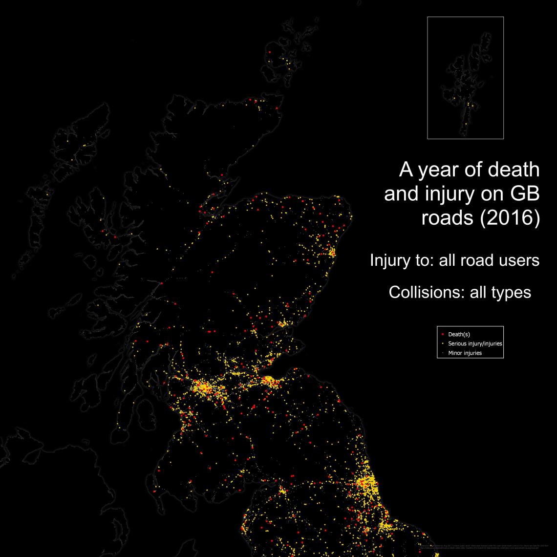
Image 3. All deaths and injuries. Central Scotland. 2016

Image 4. All deaths and injuries. London. 2016
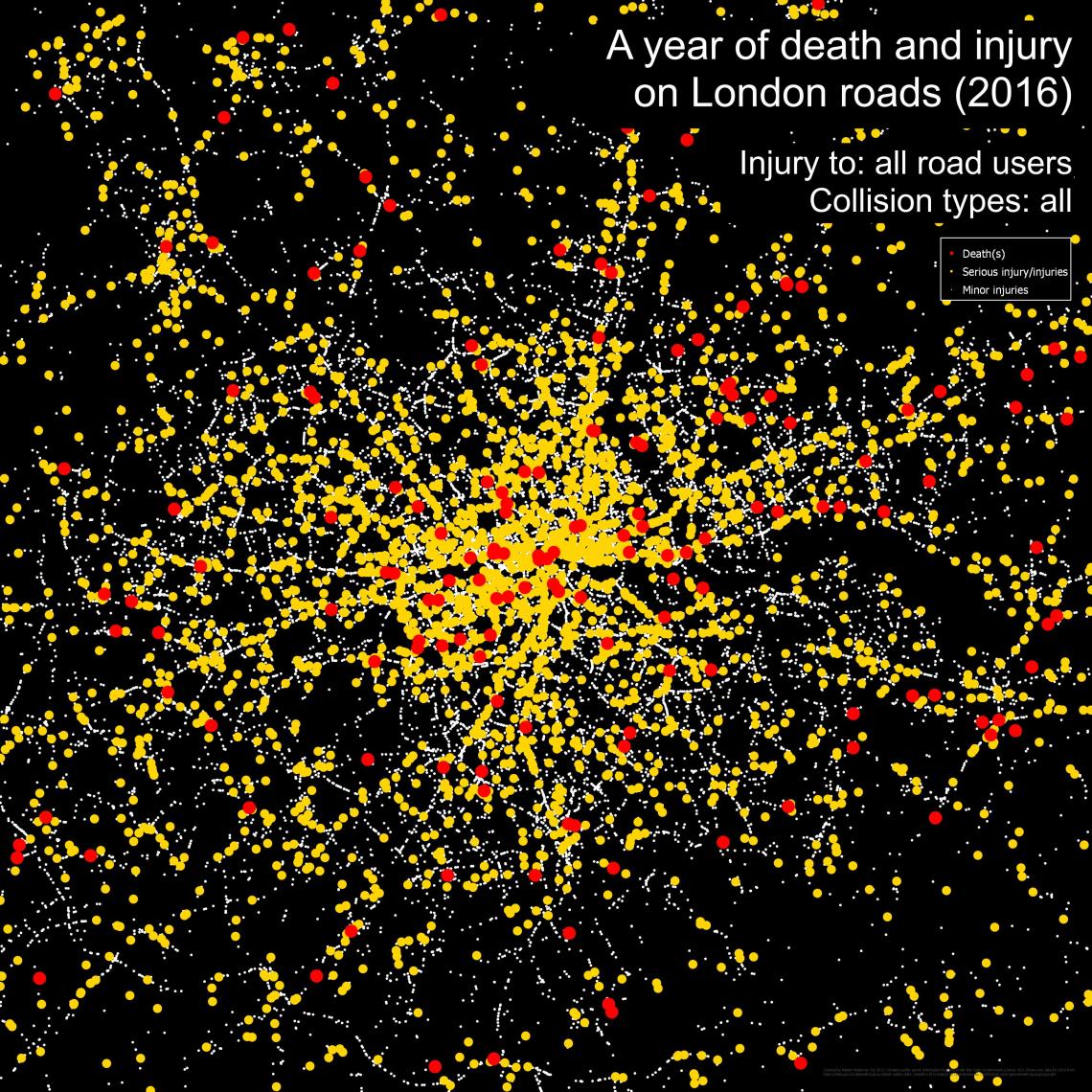
Image 5 (animation). All UK. Comparing injury to pedestrians. 2016
This animation/image provides a simple comparison of the sources of injury to those on foot. Note that a larger version, and a larger slow-changing version, can be seen using the links below the image.
My motivation in producing this image should be clear. ALL of these situations deserve to be talked about. A road/transport system which routinely kills and severely injures people just walking about their town or city is something we should at least be worried about. Personally it doesn’t just make me worried, it makes me very angry too. But how can it be that all the attention is on injury involving those cycling… how can that make any sense at all when this is what the data says is going on…

(Open larger version)
(Open larger SLOWER animation)
The images are as follows – beginning with the one showing the highest rate of death and injury:
- Injury/death in collision with a motor vehicle¹.
- Injury/death in collision with a motor vehicle while on the pavement².
- Injury/death in collision with a bicycle.
- Injury/death in collision with a bicycle on the pavement³.
¹ All categories of motorised vehicle (including e.g. tram or agricultural vehicle)
² In ‘pavement’ category I include ‘pedestrian location’ values from the data of both ‘6’ and ‘7’ where ‘6’ means “on footway or verge” and ‘7’ means “on refuge, central island or central reservation”
³ Note that there is no ‘pedestrian location’ which refers to shared-use footway (where it is legal to cycle) so it should not be assumed that the person cycling was at fault in being in this location.
Cautionary/explanatory notes
- Red dots represent deaths, yellow represent serious injuries, and white ‘slight’ injuries. The size of the dots is irrelevant (unless otherwise stated).
- Red dots are drawn above yellow, which are drawn above white. Where two or more injuries resulted from one collision only one will be visible.
- Maps are produced from data direct from https://data.gov.uk/dataset/road-accidents-safety-data
- It is known that not all injuries, particularly if minor, are reported and/or make it into this data.
- My analysis of this data and these images has not been independently checked and inevitably errors are possible. I have carried out absolutely no checks on the accuracy of the data.
- This data does not specify fault so little or nothing can be implied about the causes of a collision.
- All spatial data has a limit to the scale at which it is collected/applied (i.e. if you zoom in too closely you’ll exceed the accuracy of the data collection).
See also
- Just one year… (2015 images)
- Read everything – New here? This is a suggested reading order.

Excellent piece and the animation is a powerful illustration of the relative hazard presented by cars and bicycles.
LikeLike
Thanks.
Robert
LikeLike